Swans are floating on the lake.
Squirrels and foxes in the forest
are looking for food by digging holes in the snow with their heads.
We, living with humans,
all got together to celebrate the new year,
and slowly started to get going again.
We wish for a happy year,
and hope to expect many fun things to come.
We wish you that this year will be a peaceful one.
We appreciate your continuous support for another year.
…………………………………………………………………………………..
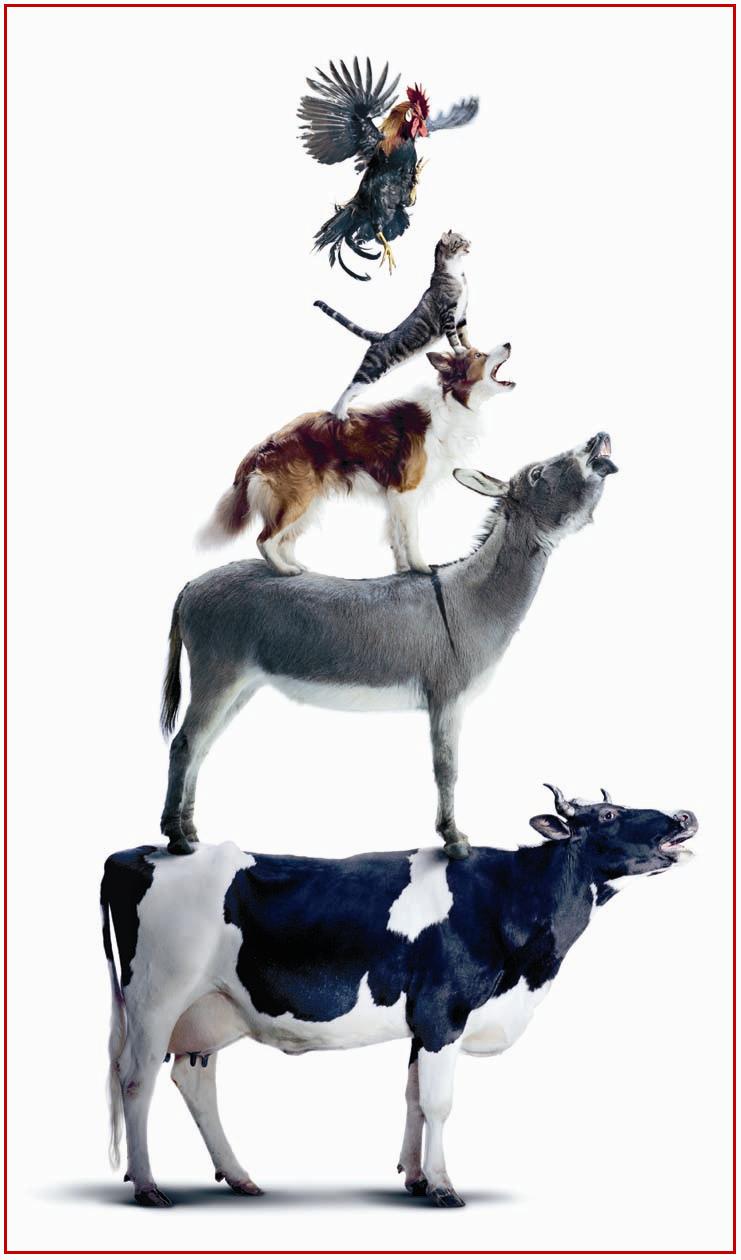
Photo:© Schweizer Milchproduzenten SMP • PSL
http://www.swissmilk.ch
Leave a Reply
The days when computer was not used as much as the present time, whether it was for advertising or book designs. It may sound like a fossil, but in those days, graphic designers used to cut and past finished phototypesetting by cleverly using a cutter knife, to create drafts. The distance between letters was neatly filled out, by picking up each letter one by one like a craftsman, insisting on strict accuracy even by millimeter less than 1mm.
Especially they were in Japanese that required combinations of vast variety of letters that were not found in alphabets or other languages, therefore, it was easily understood that all the letters could not be apart from each other at an equal distance.
Looking at such manners over my shoulder, I was asked for my opinions for reference, and gradually I found myself demanding not to cut here or I did not like certain typeface and so on, looking at my written work in front of me.
While the concept called Swiss Design includes almost every scope of our daily life, such as from typography to stationeries, medical equipments, furniture and architecture, the basic base for the design is the international typography format that was developed in Switzerland after 1950s, or a graphic design style called Swiss Style.
Switzerland where a great deal of avant garde influence of the early 20th century were found, such as Dada, formalism and Bauhaus, and escaped from the calamity of two great wars, started to embrace designs rapidly, which became systemized and lead to a dissemination in the world.
The typography without mustache-like decoration called Sans-Serif, must have an asymmetrical layout, must use grid, and it is aligned from left to flow to the right.。
The name which you hear repeatedly like a mythology is Akzindenz Grotesk. Futura that was published by Paul Renner who used to teach at Bauhaus became familiar, thanks to the logos of Volkswagen and Louis Vuitton later on.
It was 1954 when Adrian Frutiger designed Univers, and in 1957, Helvetica was born by Max Miedinger and Eduard Hoffmann. It is the typeface used by BMW and Lufthansa, and due to its high-frequency use, it has been used quite often for CIs for Japanese corporations.
In Switzerland which has 4 languages of German, French, Italian and Romansch, this typeface was named after the Swiss formal Latin name of Confederatio Helvetica, where no disproportionate emphasis would be placed on any of these languages.
It is generally believed that the reason why this typeface is easily applicable to any languages is that the mother body of the design consisted of many languages.
While this lean Swiss design obtained by trimming any fluff, will be handed down to a new generation, it will encounter many adventures in various fields in the future.
In the age where innovative designs are born one after another from the history that minimalism was sought after, when I saw this advertisement, I felt some attention different from a so-to-speak modern and evolved Swiss typography, something that is moving backward.
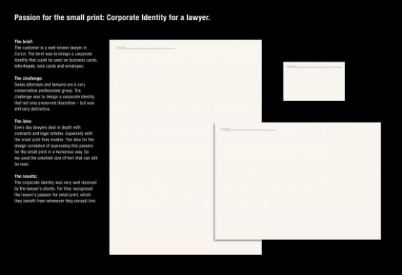
Although it is true that there are many lawyers in Zurich, the center of economy, it sounds like this lawyer is a well-known lawyer in Zurich.
The hint is such small letters in legal documents, that lawyers look closely everyday for business, is lowered in Q numbers that you may want to use magnifying glass to read it. I heard that the humor of this CI design is that how big profit is brought about from such small letters, and how passionately they read such letters. I do not understand well whether this type of joke is the world standard or not.
Although it is well legible in the original size, it dared to choose the lowest Q numbers that is legible for understanding.
It won a Bronze Lion award in Cannes last year, and has entered in this year’s Clio as well.
…………………………………………………………………………………………
Title: ION EGLIN SMALL PRINTED DESIGN
Advertiser/Client: Ion Eglin Jurist Of Law
Product/Service: LAWYER
Design/Advertising Agency: RUF LANZ Zurich, SWITZERLAND
Creative Credits
Creative Director: Markus Ruf /Danielle Lanz
Art Director: Lorenz Clormann
Copywriter: Markus Ruf
Account Supervisor: Nicole Sommermeyer
Leave a Reply

Although the poster caught my eye, I did not know where this gym was located. It seemed like somewhere in the residential area.
Besides, when I was going through their programs, all looked stoic and hard.
I believe for those of you who have solid goals and can face yourself sternly, private trainers are more than welcome to train you. For me, once I join this type of group lessons, I will be overwhelmed by the seriousness and enthusiasm of my neighbors, and I am pretty sure I will be the first one to drop out.
The season that you can show off your skin is just around the corner. We wish to wear something low-cut in the front or in the back, of course.
However, the road to go is quite hard.
・・・・・・・・・・・・・・・・・・・・・・・・・・・・・・・・・・・・・・・・・・・・・・・・・・・・・
Brand:DAVID GYM
Advertising Agency:Publicis Zurich
Creative Director: Florian Beck
Art Director: Denis Schwarz/Florian Beck
Illustrator: Graphics: Thomas Berger
Photographer: Jonathan Heyer
Leave a Reply
It’s a beautiful sunny day. The snow-capped Alps is showing off its crisp elegant lines.
Long nights are already here and it gets dark already at around 5 o’clock in the afternoon.
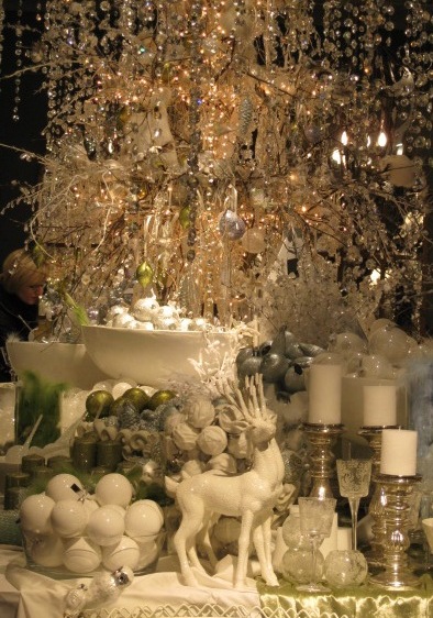
When I was walking in a hurry, looking at the roast chestnuts vender out of the corner of my eyes, I notice that one Christmas illumination has just been turned on. Where this small full light came from was deep in the cobblestone lane. The street in front of the station where the tram runs changed to a sort of blueish light of modern art 4 years ago.
Ladders were placed against the humongous tree in front of the huge bank building, and you could see many shadows moving, carrying big red or gold balls.
Since it is time for occasions that you dress up more frequently, the evening gym is getting more and more crowded. The festive season with continuous heavy meals is just around the corner.
I am getting nervous again, as I fear of my ritual failure. It seems to happen just before I am ready to go out, when I put on the clothes I have planned to wear, and they look something different than I thought would look.
The gym I go is just an ordinary one, but it is convenient as it is located in the center of the town. Furthermore, it is the area where many ethnic groups of people live like a compacted Zurich, in which environment I feel comfortable as a foreigner.
As a variety of people from various parts of the globe gather together here, you will hear many languages such as English, with various accents, German, French, Italian, Spanish and Swiss German.
Zurich is a city I expected to be conservative and low-keyed. However, once I started to come and go through this locker room, my impression has dramatically changed.
Especially this time zone, it is totally different from daytime. The age group becomes much younger, which adds some sort of glamour.
A fashionable madam is getting ready to leave by looking at her watch. A young woman who looks like a model, is looking at herself, standing in front of the mirror, with her chin up.
As the neighborhood is the financial district, some of the members may be working for such institutions. Sooner or later when the weather gets colder, it is quite a site to see all those fur coats lined-up on the hangers.
While every visitor from Japan says this is a sophisticated town, just looking at some fragment like this, might be convincing enough for you that it is a rich town.
As I had a little shopping to do, I rushed into one department store just before its closing time, carrying my half-finished bottle of Evian.
Some modest little present to my friend.
Many people seem to have decided on the color or design for this year. So I hesitated a bit, but I picked up for my table one cubic candle in the color of off-white, among the Christmas ornaments.
Winter rain has started to fall now.
Leave a Reply
My Swiss female friends are very good at wearing scarves.
Simply tying a scarf around your neck over a white blouse or a cashmere sweater is a standard style that everybody knows. I don’t recall exactly when, but once I saw a woman simply spreading a large pink Hermes scarf over a dark brown jacket, which really impressed me with the interesting color combination. It matched very well with her blond hair.
Although I know it will cheer you up when you wear something in vivid color on a cloudy day, I always tend to pick up something very dark.
As we are expecting a long winter now, I went through my closet to find some colors for accent.
There is one scarf that has been left at the same place since last year. Although it is true that I have been treating it as something special, it has become difficult to put it on once you lost a good timing. So it has never been outside my closet.
There is one nice shop that deals with good quality textiles along the lake. I casually drop in each season as they carry or produce something unusual.
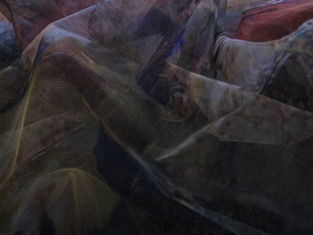
That was surely one afternoon of early winter. The antique room must have been at least 150 years old. When I was talking with the designer at one corner of this room, I just realized this scarf was simply placed by the windowsill.
It was a mysterious lace that revealed many colors though the light. When I got close to it, it was a cloth just like the wind.
When I picked it up to take a look, she happily smiled at me.
She said, “It is a lace from St. Gallen. I, myself, found it. It is really a great piece of work. I believe how you use it, is just like how you wear a piece of jewelry”.
St. Gallen. If you hear this place name, a meddeval town comes to your mind right away.
It is located in the east of Zurich, about 1 hour train ride. Up to the area around the monastery, which is believed to be the masterpiece of baroque architecture, the town has a splendor scenery and is designated a World Heritage Site. While it is well known as a town of academics, it is also once a prosperous town with long history of textiles, laces and embroideries.
A lace of winter color sent from such a town.
There were enough reasons to purchase that.
Leave a Reply
021
Close to the Cathedral, there is one shop I drop in occasionally when I stroll on the stone-paved streets of the old town of Niederdorf.
Stefi Talmam.
While she is considered as a Swiss designer who is capable in the wide-range of fields from architecture to typography or industrial design, she is also a well-known cutting edge in the fashion field.
Her collection is interesting and has surprises in the color variation, mainly in the shoes and bags as well as small items and accessories that decorate the windows. Especially, the combination of the leather used for the base and colorful unborn calf. It is amazing to see the well-thought combination balance of humor, intelligence, and functionality.
Since mid 1920’s, most of the people who have been innovative in the design world of this country are those who had moved to Switzerland from overseas. Stefi is no exception. She is a cosmopolitan of European and Asian origin.
While incorporating sharp and simple conventional Swiss design, targeting to the working women with borderless sense is probably, I believe, very Zurich like.
She has established popularity among assertive Swiss women, and has many fans in USA and Asia as well. http://www.stefitalman.ch/
Leave a Reply
yogaa_lay_rgb_01
yogab_lay_rgb
yogac_lay_rgb
Nice to meet you. We are Swiss cows.
For this year’s summer campaign ad, we ran through the city by skateboarding Although it was a hard work, we were able to manage smooth riding, and the finish is quite good, too.
But, when you think of it, we believe it was the result of our yoga training for several months last year.。Munching grasses and taking naps are not good enough. In order to have a good quality of milk, we also need fitness exercises.
If you feel like, join us.
Photo by SMP
http://www.swissmilk.ch