We once went to an island called Grand Canaria in Spain for holidays one year.
It was about 30-minute drive form Las Palmas, the capital. The beach used to be a desert, but became a white sandy beach under the strong sunshine when the ground had physically moved in part. You can see the Northern part of Africa from this beach.
Although I don’t recall seeing any Asian people, I wonder any Japanese businessmen working for trading companies live there. Anyway, there were many German guests for long holidays, and German language was more popular than English at the hotel.
Away from city life, in the resort where everything could be done within the hotel, for those who usually stay for 2 weeks or as long as 1 month, a small society-like system is born, although you could be lazy and footloose. You will be required a certain sociability that maintains a certain distance from each other within the group.
On the Asian beaches, even at some prestigious hotels, you can be an easy goer, not paying too much attention to what you wear.
Compared to that, it is quite a different story in European hotels in high season.
It is forbidden to wear the same clothes everyday. Rules are slightly different for breakfast, garden lunch, and dinner.
Large pearl pierced earrings seem to be the norm for a group of madams by the poolside. Some madam with presence has a loose hair updo with heavy-looking gold necklace. Bathing suit and jewelries…
Well made up faces. For those who do not swim, that works since they don’t put their faces in the water.
On their feet, stilettos instead of rubber flip flops.
Of course, bikinis will change everyday. Therefore, the color of the stole and sandals will change accordingly.
Doesn’t it require lot of energy?
This overwhelming gesture to show off something casually was one of the biggest culture shocks for me when I moved to Europe.
While we enjoyed several dinners in the restaurant in the garden at night, we went out occasionally, as we got tired of after a few days.
One evening, we asked for a taxi to take us somewhere near the port.
Several simple restaurants were seen in the surroundings of a quiet port.
The hunch in this kind of situation cannot be complained even if it does not prove right.
Right beside an old poster of a sun-tanned girl in bikini, the pictures of shrimps, lobsters, squids, octopuses, and other fish which names I did not know, were pasted on the wall one by one, and the menu had pictures of the dishes they served.
Everything looked good. I would love to try all.
Squid or octopus.
My husband loves mollusk. If it was hard to decide, we could order both, but 2 plates of mollusk were not easy to take for me. Finally, after much agonizing, I decided on the squid.
After a short while, 8 Spanish people that looked like a family and friends, lead by a man who looked like the father, came to sit at the big table next to us.
They opened the menu and closed it after a quick glance. It somehow appeared to be a confirmation work, and no hesitation was observed. Anywhere in the world in common is that the dishes that locals eat are the best.
On the plate brought shortly after, a huge octopus, I was sure it must have measured at least 30cm in length, was placed with its legs boldly rolled up, in front of each member of the group. 8 Legs, which meant they were all the legs of one huge octopus. It was quite an overwhelming sight.
Of course, it was not a decent manner to observe other tables in a restaurant and we fully understood that, but we could see as it was in sight.
It appeared that the octopus was easily cut by knife. And, we could feel its juicy texture that we imagined judging from the softness of the flesh despite its large size.
I was not saying that our squid was bad.
After a long swimming in the North Atlantic Ocean, just unloaded this morning from the small boat of a fisherman, the squid was delicious, of course.
However, since this place was not on our itinerary for the following night, I could not come here again the next day and order, “I would like to try the octopus today!”
Since then, whenever we go to some island, my mind is thrown into chaos between octopus and squid. However, I would love to see a huge soft-looking octopus legs placed in front of me, like that family, and I still dream of eating that without hesitation until my stomach is full.
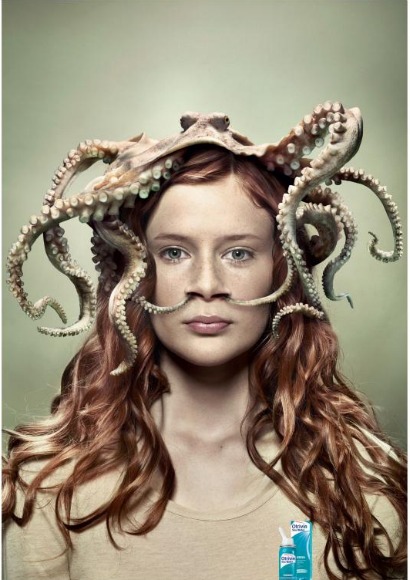
Novartis, a Swiss pharmaceutical company, impresses us every time with its unusual visual.
This is a series advertisement for nasal decongestant called, “Let The Sea Help You Breathe.”
The series consists of 3 images of octopus, crab and sea horse. After all, octopus is the player. This bold visual communication is a success.
It was created by Saatchi & Saatchi in Tel Aviv and Switzerland, and developed in Sweden.
・・・・・・・・・・・・・・・・・・・・・・・・・・・・・・・・・・・・・・・・・・・・・・・・・・・・・・・・・・・・・・
Client: Novartis
Brand: Otrivin
Media: Print
Title: Let The Sea Help You Breathe
Description: A print campaign for Otrivin nasal decongestant.
Advertising agencies: BBR Saatchi & Saatchi Tel Aviv and Saatchi & Saatchi Switzerland
Leave a Reply
![]()
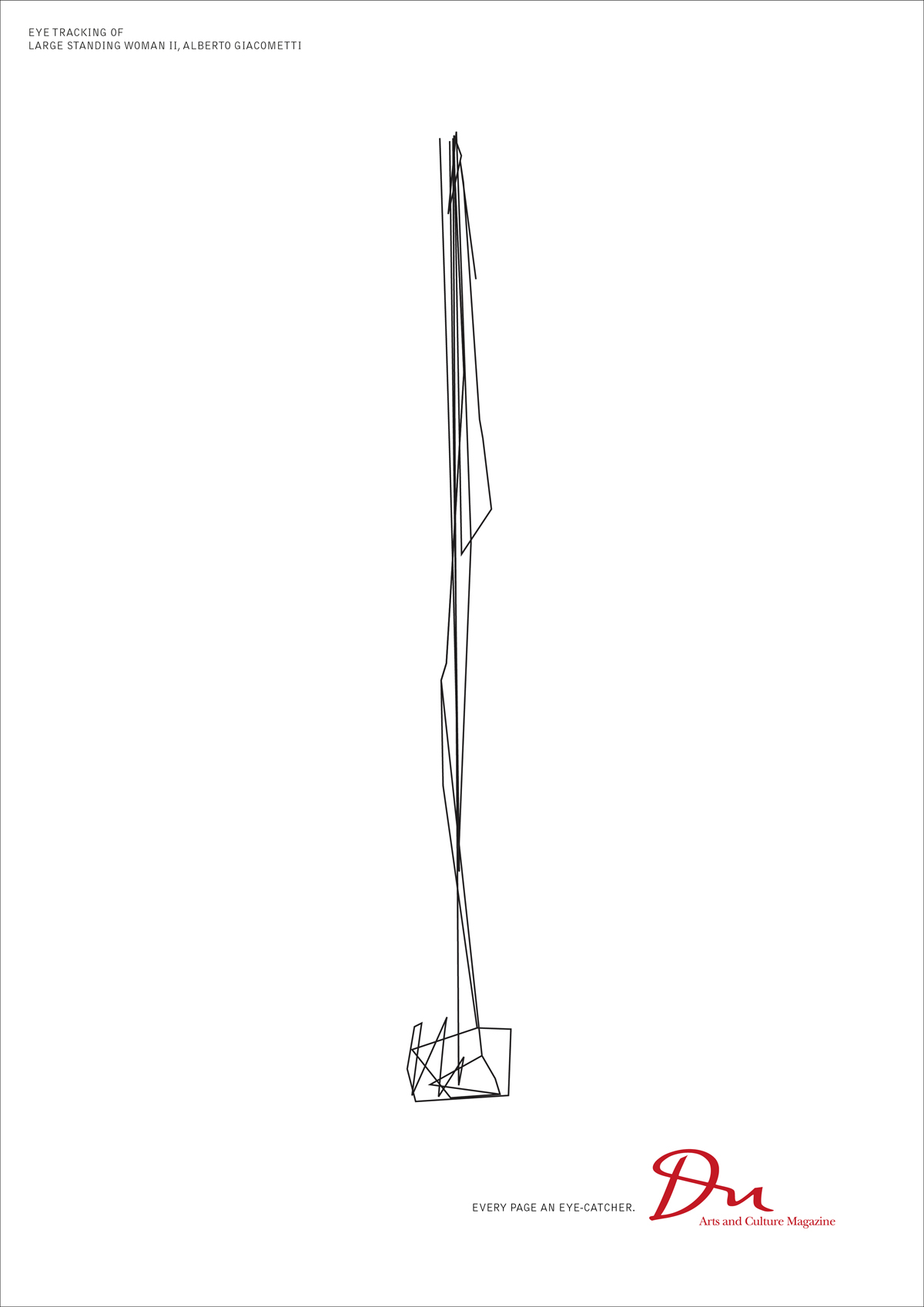
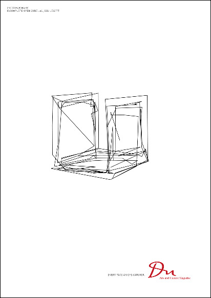
If there are people who can recall the name of the artist by looking at these drawings, they must be experts of fine art, I wonder.
Du is a Swiss magazine of art and culture, issued and sold in the German-speaking Switzerland.
They always commission top-class photographers, and the magazine is like a good example of Swiss designs, featuring graphic designs in a very cool manner.
A sense of distance brings us comfort, and it is sophisticated as well as beautiful, as one can declare as “EVERY PAGE AN EYE-CATHER.”
Beyond these 3 drawings, you can foresee 3D spaces. It is fascinating that they make us imagine such images.
EYE TRACKING Series Advertisements
Jeff Koons HANGING HEART
Alberto Giacometti LARGE STANDING WOMAN Ⅱ
Sol Lewitt INCOMPLETE OPEN CUBE 10/1
The current July/August issue features the Motreux Jazz Festival that started from the 2nd of July.
・・・・・・・・・・・・・・・・・・・・・・・・・・・・・・・・・・・・・・・・・・・・・・・・・・・・・・・・・・・・・・・・・・・・・・・・・・・・・
Advertising Agency: Euro RSCG Zürich, Switzerland
Executive Creative Director: Frank Bodin
Creative Director: Axel Eckstein
Copywriter: Ivan Madeo
Art Director: Christina Wellnhofer
Graphic Designer: Sarah Kahn
808jpg
http://www.du-magazin.com/
Leave a Reply
The days when computer was not used as much as the present time, whether it was for advertising or book designs. It may sound like a fossil, but in those days, graphic designers used to cut and past finished phototypesetting by cleverly using a cutter knife, to create drafts. The distance between letters was neatly filled out, by picking up each letter one by one like a craftsman, insisting on strict accuracy even by millimeter less than 1mm.
Especially they were in Japanese that required combinations of vast variety of letters that were not found in alphabets or other languages, therefore, it was easily understood that all the letters could not be apart from each other at an equal distance.
Looking at such manners over my shoulder, I was asked for my opinions for reference, and gradually I found myself demanding not to cut here or I did not like certain typeface and so on, looking at my written work in front of me.
While the concept called Swiss Design includes almost every scope of our daily life, such as from typography to stationeries, medical equipments, furniture and architecture, the basic base for the design is the international typography format that was developed in Switzerland after 1950s, or a graphic design style called Swiss Style.
Switzerland where a great deal of avant garde influence of the early 20th century were found, such as Dada, formalism and Bauhaus, and escaped from the calamity of two great wars, started to embrace designs rapidly, which became systemized and lead to a dissemination in the world.
The typography without mustache-like decoration called Sans-Serif, must have an asymmetrical layout, must use grid, and it is aligned from left to flow to the right.。
The name which you hear repeatedly like a mythology is Akzindenz Grotesk. Futura that was published by Paul Renner who used to teach at Bauhaus became familiar, thanks to the logos of Volkswagen and Louis Vuitton later on.
It was 1954 when Adrian Frutiger designed Univers, and in 1957, Helvetica was born by Max Miedinger and Eduard Hoffmann. It is the typeface used by BMW and Lufthansa, and due to its high-frequency use, it has been used quite often for CIs for Japanese corporations.
In Switzerland which has 4 languages of German, French, Italian and Romansch, this typeface was named after the Swiss formal Latin name of Confederatio Helvetica, where no disproportionate emphasis would be placed on any of these languages.
It is generally believed that the reason why this typeface is easily applicable to any languages is that the mother body of the design consisted of many languages.
While this lean Swiss design obtained by trimming any fluff, will be handed down to a new generation, it will encounter many adventures in various fields in the future.
In the age where innovative designs are born one after another from the history that minimalism was sought after, when I saw this advertisement, I felt some attention different from a so-to-speak modern and evolved Swiss typography, something that is moving backward.
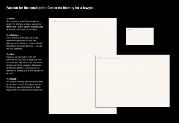
Although it is true that there are many lawyers in Zurich, the center of economy, it sounds like this lawyer is a well-known lawyer in Zurich.
The hint is such small letters in legal documents, that lawyers look closely everyday for business, is lowered in Q numbers that you may want to use magnifying glass to read it. I heard that the humor of this CI design is that how big profit is brought about from such small letters, and how passionately they read such letters. I do not understand well whether this type of joke is the world standard or not.
Although it is well legible in the original size, it dared to choose the lowest Q numbers that is legible for understanding.
It won a Bronze Lion award in Cannes last year, and has entered in this year’s Clio as well.
…………………………………………………………………………………………
Title: ION EGLIN SMALL PRINTED DESIGN
Advertiser/Client: Ion Eglin Jurist Of Law
Product/Service: LAWYER
Design/Advertising Agency: RUF LANZ Zurich, SWITZERLAND
Creative Credits
Creative Director: Markus Ruf /Danielle Lanz
Art Director: Lorenz Clormann
Copywriter: Markus Ruf
Account Supervisor: Nicole Sommermeyer
Leave a Reply
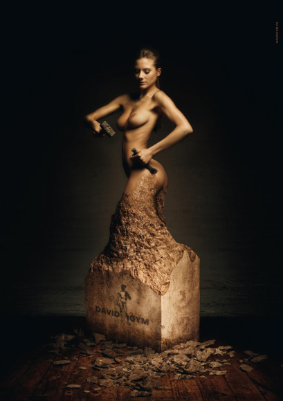
Although the poster caught my eye, I did not know where this gym was located. It seemed like somewhere in the residential area.
Besides, when I was going through their programs, all looked stoic and hard.
I believe for those of you who have solid goals and can face yourself sternly, private trainers are more than welcome to train you. For me, once I join this type of group lessons, I will be overwhelmed by the seriousness and enthusiasm of my neighbors, and I am pretty sure I will be the first one to drop out.
The season that you can show off your skin is just around the corner. We wish to wear something low-cut in the front or in the back, of course.
However, the road to go is quite hard.
・・・・・・・・・・・・・・・・・・・・・・・・・・・・・・・・・・・・・・・・・・・・・・・・・・・・・
Brand:DAVID GYM
Advertising Agency:Publicis Zurich
Creative Director: Florian Beck
Art Director: Denis Schwarz/Florian Beck
Illustrator: Graphics: Thomas Berger
Photographer: Jonathan Heyer
Leave a Reply
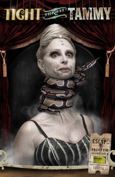
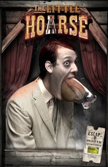
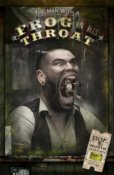
A little while ago, when I was waiting for the tram, I felt some bizarre human figures behind my back.
In this city of Zurich, as you may encounter certain things or people far from the practical world, I thought it would be this sort of thing, and got on the tram without turning around.
My way back home. Now I saw those people from the window of my tram.
They seemed to have sore throats.
Tammy’s throat is tighten up by the snake and she lost her voice. Her friend talks in “hoarse voice” because “the little horse” is kicking inside his throat. Another friend has got a “frog in his throat” which makes his throat sore after all.
To fight against these wild beasts that bring such horrors, ordinary throat candies will not work.
“MEBUCAINE SORE THROAT REMEDY” is here to bring you peace to your throat.
Well, to demonstrate how powerful these drops are, let’s appeal its high efficacy with sharp visual impacts. The mode of expression is surreal anyway.
Love to see those people who have made such a decision.
This is a series of advertisement of Novartis, an international enterprise with its headquarters in Basel, Switzerland, who is also a topnotch leader in the pharmaceutical and biotechnology industry.
The campaign title is “Escape the Mouth Horrors.”
Brand : MEBUCAINE SORE THROAT REMEDY
Advertising Agency: Saatchi & Saatchi, Cape Town / Geneva
Executive Creative Director: John Pallant
Creative Director: Anton Crone
Art Director: Larissa Elliott
Copywriter: Alice Gnodde
Illustrator: Am I Collective
Photographer: Jillian Lochner
Leave a Reply

You can watch the CM at: http://vimeo.com/5065285
As this CM gives us the feelings of light and life, it might be a good idea to review it at this time of the year when things are gloomy.
Although the Swiss International Airline is currently under Lufthansa umbrella, it is still remains the face of Switzerland.
YOUR FLIGHT, SWISS MADE
Their mottos are “personal care,” “Swiss hospitality,” and “quality in every detail.”
This short film is the work of collaboration with Swiss film director, Marc Foster. Although it was created last year, the film is still being aired as a long run.
2 minutes and 27 seconds.
………………………………………………………………………………………….
Agency: Publicis Zurich
Creative: Martin Deneke
Director: Marc Forster
Producer: Peter Lehner
Director of Photography: Roberto Schaefer
Editor: Jay Nelson
Brand: Swiss Air
Production: Ping Pong Animation: MK12
Leave a Reply

Photo: Animaris Percipiere Thumb Theo Jansen degital brainstorming
There is a think tank team called “Brainstorming” who sends out unique contemporary art works. While explaining its background may require some length of time, a Dutch kinetic sculptor, Teo Jansen was introduced by this group the other day.
Since the large-scale exhibition, first time in Asia, was held in Hibiya, Tokyo from January to April this year, many of you may already have seen his works.
The CM entitled “Defining innovation” onaired in South Africa in 2006, was talked about a lot around the world.
A strange “living creature” that you had never seen before, walked on a wind-whipped dark beach together with Jansen, fighting against a roaring rainstorm. This mysterious image and his economical phrase were cool and it demonstrated his excellent sense of creativity.
This time, Jansen has brought “Animaris Umerus” and some of its buddy small “living creatures” to Zurich.
Plastic pipes which induce electricity that ordinary household use. The framework is made by using nylon strings to fasten these pipes. Electric cables or vinyl strings were also used. Despite my expectation that he would not use any organic materials, he answered in the interview that he used egg white for the eyes and skins for some reason.

Animals on a sandy beach, or beach animals. Although such names are well known in Japan, “Strandbiester,” the German word for that, emphasizes more on an animal image that has landed from the ocean, which sounds mysterious for its collective term itself. It also gives somewhat humorous nuance such as something dangerous but cute.
As if it is a living creature of Paleozoic era, having numerous legs like a monster centipede, moves and runs by wind power. Because of the grandness of each “creature” he has created and its interesting sound of Latin language, one may easily imagine a dinosaur.
Although Jansen majored in physics at the Delft University of Technology, he became a painter.
I believe it was before he became the painter, when he used to walk along the beach to put together his scripts for newspapers. I am not sure for what he was writing the script, but one day, he was inspired to create an image of a large “living creature” walking on a sandy beach.
It had been a long time since that day.
It was September, 19 years ago. He went to purchase plastic pipes.
“Throughout that afternoon, I was playing around with those pipes. It was almost evening time. I felt certain that I would be living with these plastic pipes for the rest of my life.”
Technical ideas and art were united, and a totally new “living creature” baby was born on this day.
“They don’t require any food. What they need to survive is simply the wind. They do not need time to move around to find food, like other animals.”

“Living creatures” of Jansen eat the wind and live on a sandy beach.
“They can play with children on the beach, or they can live together with other animals. However, since the living creatures that I create continuously evolve, soon or later they may become wiser than human beings. It is a form of new life.”
“Why are you keep on creating living creatures on the beach?”
“Why? I don’t know. Now let me ask you. Why we, human beings, live on this earth?”
Interview:Digital Brainstorming
http://www.digitalbrainstorming.ch/
BMW 「Defining innovation」
http://www.bmw.co.za/onlinenews/issue1/advert.html
Leave a Reply
yogaa_lay_rgb_01
yogab_lay_rgb
yogac_lay_rgb
Nice to meet you. We are Swiss cows.
For this year’s summer campaign ad, we ran through the city by skateboarding Although it was a hard work, we were able to manage smooth riding, and the finish is quite good, too.
But, when you think of it, we believe it was the result of our yoga training for several months last year.。Munching grasses and taking naps are not good enough. In order to have a good quality of milk, we also need fitness exercises.
If you feel like, join us.
Photo by SMP
http://www.swissmilk.ch
Leave a Reply
garten-city-3-3
Huge planters are all over the city of Zurich at the moment.
Gartencity Zürich 2009 Campaign which commenced early this summer
It is a unique plan by the Zurich Tourism Office, which theme was integration of art & design, plants & nature, and city and environment. The planters are made of glass-fiber-enforced polyester, with the height of 150 cm and diameter of 120 cm. The participating artists around the world as well as from Switzerland have created these planters.
Swiss artist, HR Giger, who is well-known for the movie “Alian,” and Hans Langner from Germany are among such artists. From Accademia di Brera in Milan, collaboration of the professors and students contributed to some creations.
garten-city-88
06262
From the Zurich Airport to the center of the city, especially along the shopping street stating from the Central Station, the streets are decorated by artworks, and the area from the Baunhof strasse to Paradeplatz is one of the highlights. The artworks are arranged so that they will lead you from here to the lake, to the stone-paved old part of the city near the Lake Limmat and then to the Opera House. The number of artworks easily surpasses 300 in the whole city. 。
Oleander, palm, dogwood, Bird of Paradise, Japanese maple tree, fig tree, chestnut tree, and so on…
More than 30 different kinds of plants were planted, and every little daily changes you may notice when you pass by will never bore you out during this 4-momth long-term campaign.
The current season is the most beautiful time of the year. With full of colorful flowers in bloom, the whole city has become a mysterious garden.
garten-city-99
0077
Although the art displayed here vary every year, it goes back to the Cow Parade in 1998. The participating artists painted freely the top of the head of 400 glass-fiber cows, which were displayed all over the city. This body-painting on cows become a big topic, much more than the city had expected, and the number of cows during the campaign reached 800, we understand.
Furthermore, this trend expanded to Chicago, New York, and other parts of Europe. Even in Tokyo, cows had appeared 3 times until last year.
Later, here in the original city of Zurich, cows changed to benches, then teddy bears and then this year’s huge planters.
05252
garten-city-14141
0044
One interesting thing is that around the time when this event started in 1998, Zurich started to attract attention as the base of modern art, and artists around the world started to move into this city. The time overlaps this era when creative activities grew stronger.
When they thought about marketing the city, utilizing the brand power of “cows” and the power of modern art riding the wave of attention, was probably very natural.
First of all, Zurich is the birthplace of Dada. Therefore, this city has the ability to accept avant-garde.
garten-city-2626
garten-city-20201
From children to the elderly, the messages conveyed through art and plants are gentle.
Having the distance shortened by art, and having art as the hook to talk to people and society, Garten-City Zurich 2009, advertises the city in a dynamic way.
Richness of nature, and accessibility. While this campaign is a development of brand strategies to enhance the image of Zurich as a sustainable city, focusing on attracting tourism, it is, at the same time, to launch innovative charm that this city has as well.
Zurich does not have convenience stores like in Japan. Although it is an international city, one may feel that time goes several times slower than Tokyo.
However, iphone is a big boom even here, and information is customized by the development of cell phones and Internet.
On the other hand, while communication may become more personal, people still love the warms of skin and voice, and sometimes feel like to join the circle of dance. Such simple excitement and thrill are next-door neighbors.
Working people stride on the street. A young person is enjoying sunbathing on the lawn. Old lady of your next-door neighbor is talking about her cat. You pass by a traveler.
Thinking about the fact that people of every genre share and experience the same air, having the city as the media, you may feel that there is a future for communication.
Something makes me feel happy.
It will be held until September 20, 2009.
http://www.gartencity.ch