The days when computer was not used as much as the present time, whether it was for advertising or book designs. It may sound like a fossil, but in those days, graphic designers used to cut and past finished phototypesetting by cleverly using a cutter knife, to create drafts. The distance between letters was neatly filled out, by picking up each letter one by one like a craftsman, insisting on strict accuracy even by millimeter less than 1mm.
Especially they were in Japanese that required combinations of vast variety of letters that were not found in alphabets or other languages, therefore, it was easily understood that all the letters could not be apart from each other at an equal distance.
Looking at such manners over my shoulder, I was asked for my opinions for reference, and gradually I found myself demanding not to cut here or I did not like certain typeface and so on, looking at my written work in front of me.
While the concept called Swiss Design includes almost every scope of our daily life, such as from typography to stationeries, medical equipments, furniture and architecture, the basic base for the design is the international typography format that was developed in Switzerland after 1950s, or a graphic design style called Swiss Style.
Switzerland where a great deal of avant garde influence of the early 20th century were found, such as Dada, formalism and Bauhaus, and escaped from the calamity of two great wars, started to embrace designs rapidly, which became systemized and lead to a dissemination in the world.
The typography without mustache-like decoration called Sans-Serif, must have an asymmetrical layout, must use grid, and it is aligned from left to flow to the right.。
The name which you hear repeatedly like a mythology is Akzindenz Grotesk. Futura that was published by Paul Renner who used to teach at Bauhaus became familiar, thanks to the logos of Volkswagen and Louis Vuitton later on.
It was 1954 when Adrian Frutiger designed Univers, and in 1957, Helvetica was born by Max Miedinger and Eduard Hoffmann. It is the typeface used by BMW and Lufthansa, and due to its high-frequency use, it has been used quite often for CIs for Japanese corporations.
In Switzerland which has 4 languages of German, French, Italian and Romansch, this typeface was named after the Swiss formal Latin name of Confederatio Helvetica, where no disproportionate emphasis would be placed on any of these languages.
It is generally believed that the reason why this typeface is easily applicable to any languages is that the mother body of the design consisted of many languages.
While this lean Swiss design obtained by trimming any fluff, will be handed down to a new generation, it will encounter many adventures in various fields in the future.
In the age where innovative designs are born one after another from the history that minimalism was sought after, when I saw this advertisement, I felt some attention different from a so-to-speak modern and evolved Swiss typography, something that is moving backward.
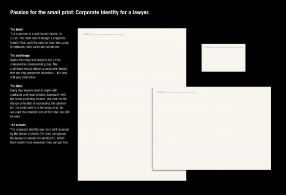
Although it is true that there are many lawyers in Zurich, the center of economy, it sounds like this lawyer is a well-known lawyer in Zurich.
The hint is such small letters in legal documents, that lawyers look closely everyday for business, is lowered in Q numbers that you may want to use magnifying glass to read it. I heard that the humor of this CI design is that how big profit is brought about from such small letters, and how passionately they read such letters. I do not understand well whether this type of joke is the world standard or not.
Although it is well legible in the original size, it dared to choose the lowest Q numbers that is legible for understanding.
It won a Bronze Lion award in Cannes last year, and has entered in this year’s Clio as well.
…………………………………………………………………………………………
Title: ION EGLIN SMALL PRINTED DESIGN
Advertiser/Client: Ion Eglin Jurist Of Law
Product/Service: LAWYER
Design/Advertising Agency: RUF LANZ Zurich, SWITZERLAND
Creative Credits
Creative Director: Markus Ruf /Danielle Lanz
Art Director: Lorenz Clormann
Copywriter: Markus Ruf
Account Supervisor: Nicole Sommermeyer
Leave your comment